
Ian Loew
With decades of experience in B2B web design, Ian Loew is Lform’s Owner, Creative Director, and Head of Business Development, which he founded in 2006.
Like any modern business, your website is the primary point of contact your customers use to interact with you. If driving new leads through your online booking system is a KPI for your company’s success, you won’t achieve this with clunky, slow-loading pages, sub-par content, and an all-around poor user experience.
We’ll go over six excellent website design tips that will help optimize your visitors’ experience and bring in more online bookings in this post.
1. Focus on Site Speed
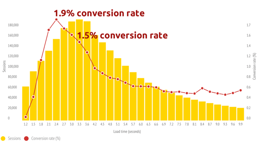
Web admins become so wrapped up in content and interactive elements that they forget one of the critical things that make the internet such a popular medium: its speed. If you overload your site with features and let site speed fall by the wayside, your customers will bounce from your site and onto a competitor’s.

Though it may not be the most creative or exciting part of developing your ecommerce website, site speed should always be at the top of your list.
Google provides a free site speed checker tool called PageSpeed Insights, which you can use to get a detailed top-level view of how your website is performing, and the elements you may need to change to help your site reach its potential.
You’ll be able to plan out the actions that will drive up your site loading speed and get you in line with your competitors. There’s a range of things you can do to optimize a website for speed, but some of the most common website design tips include:
- Using a CDN (content delivery network) to minimize the resources needed for users across multiple geographic locations to load your site.
- Moving your site to a better, faster host.
- Compressing the images on your site making them easier to load.
- Minimizing any redirects necessary to load your site.
Speed has always been an important factor in digital marketing, not just when it comes to CRO. Make optimizing your site for speed a priority, and you’ll enjoy better conversion rates and better all-around SEO.
2. Use High-Quality Visuals
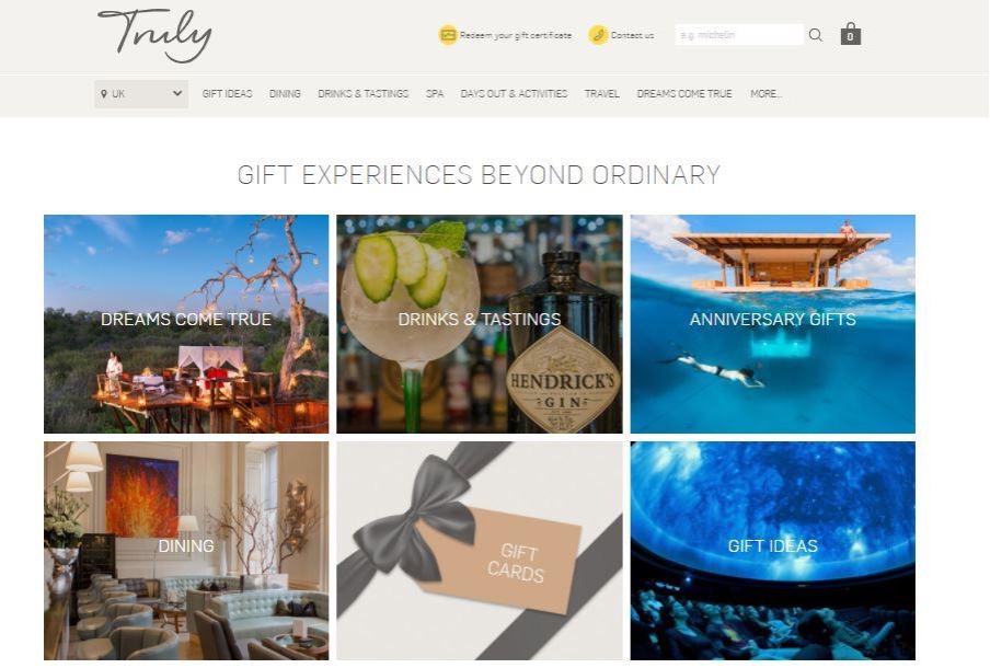
The quality of your site’s visual elements will profoundly impact the number of online bookings it rakes in. Great graphic design and images can grab a user’s attention, create an emotional response, and even mean the difference between a conversion and a bounce.
If you’re looking for inspiration, check out the Truly Experiences homepage, where each category of experience day is teased by its own unique, high-quality, clickable image.

If visitors find your choice of imagery to be tacky and low-quality, it can damage the existing trust in your brand and the quality of your product in the eyes of prospective customers.
Choosing and applying imagery effectively is one of the more creative aspects of web design. Unfortunately, you won’t be able to tackle this in an objective, measurable way without a lot of A/B testing and experimentation.
You can use a few generally accepted visual website design tips to guide you as you create a content calendar and set out a plan to optimize your site’s visuals.
- Be careful with your choice of stock imagery and use it sparingly
- Use unique icons
- Ensure your CTAs are clickable
Though a large part of modern digital marketing relates to data analysis and optimizing-by-numbers, classic advertising techniques focusing on pure visual stimulation have an essential role. Make sure this doesn’t fall by the wayside in favor of more technical website design tips!
3. Try to Upsell and Cross-Sell
Upselling can have massive benefits for your business, bringing in more revenue in less time, introducing your customers to enticing new products and services, and increasing the value of your brand in the eyes of your target market.
Holiday rental businesses are great at upselling. Companies like Vrbo offer payment protection on their checkout pages, highlighting the benefits and making purchases easy without being too in-your-face with it.

The most important piece of advice we can give you in this area is to personalize the customer’s experience.
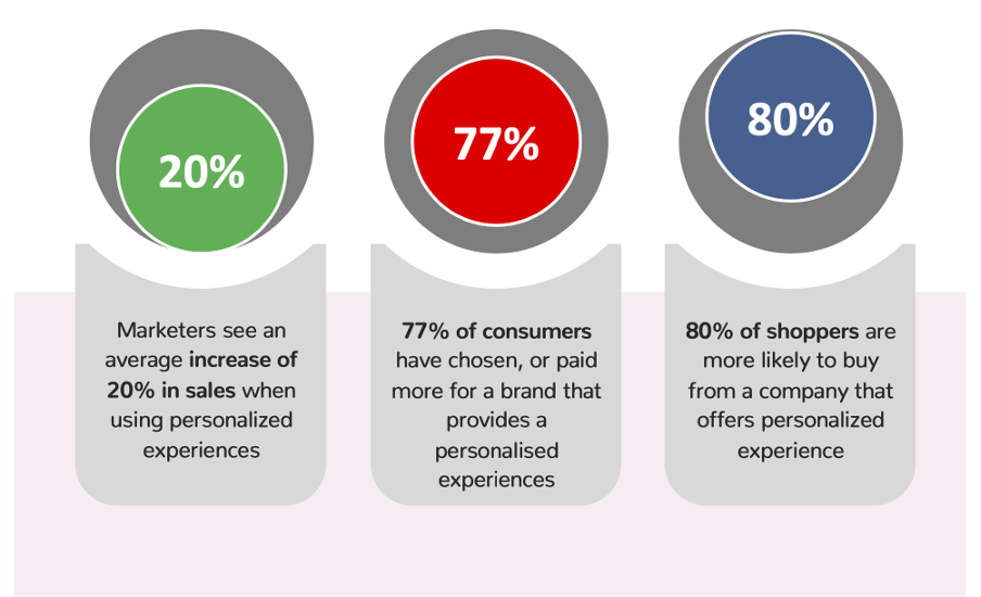
With 77% of customers choosing or paying more for a brand that personalizes their experience, it’s a no-brainer to use personalized experiences to bolster your upselling efforts.
True, the tools and processes you’ll need to automate and personalize your upsells won’t come cheap. However, if you can leverage the data on customer behavior to create upsells that will improve your customers’ experience, rather than cause friction or annoy them, your upselling efforts will garner much better results!
4. Optimize for Mobile Devices
Today, many people’s phones are their only device for browsing the internet. Like any business, yours exists in a mobile-first world, which means you need a mobile-first website to stay competitive and relevant.
It’s no good investing all your resources in a stunning and user-friendly desktop site if all your prospects will be finding you through their mobile devices and then bouncing straight away because it’s a complete mess!
One of the key objectives to bear in mind when making your site accessible and user-friendly for mobile users is to simplify your content. Think of a few big, well-known brands, check out their desktop site, and then visit the same URL on your phone.
You’ll notice that while the desktop sites tend to present reams of information and content covering countless details about the company, the mobile version is more stripped-down, concise, and built around framing the essential information in an easily-digestible way.
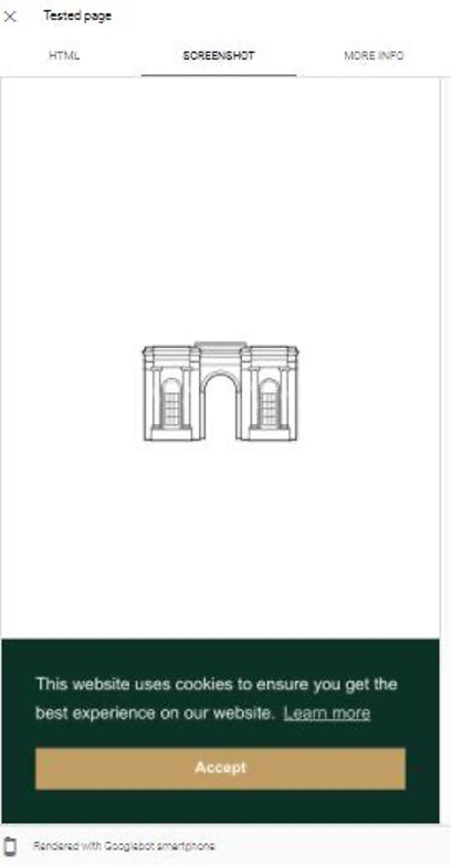
A great example of this is the Carden Park Spa site, which takes a relatively large and complex desktop site and condenses it into a more direct, more digestible experience on a mobile site.

Whatever individual design choices you make, if you keep this philosophy of simplifying your content at the front of your mind, you’ll naturally move towards a more mobile-friendly design. Whether using the AP style of writing to boil down your copy or creating streamlined versions of your visuals, simplifying your existing site design can work wonders for its mobile version.
5. Tap into Social Proof
Social proof is a long-established marketing tactic based on the idea that when consumers see a large chunk of people taking a given action, they’ll be more likely to follow suit.
Social proof is more important than ever in today’s digital-centric world, where ratings, comments, and reviews are tied to every piece of content you come across. When anyone considers paying for a product or service, looking around to see how other people have liked it is a universal step in the decision-making process.
One great example of using social proof is Air Bnb’s ‘Ask a Superhost’ program, which uses short profiles of real people who have been hosting for a significant length of time to help market the business model to new potential hosts.
There are tried-and-tested website design tips to integrate social proof in your web design, including but not limited to:
- Inviting your customers to leave public reviews of your business.
- Showing live sales and stock stats attached to a hero product or service.
- Adding trust badges and accolades.
- Displaying positive testimonials or impressive stats, e.g., “10,000 satisfied customers and counting” on pages that get a lot of traffic.
- Create pillar pages with relevant, shareable content to stimulate discussion on social media.
With immediate online communication having a massive influence on how we interact with businesses, the importance of social proof in marketing can’t be understated. Make social proof a significant part of your web design strategy, and the payoff will be huge
6. Improve your Site User Experience
We don’t need to tell you that digital marketing trends change rapidly, not least of all in web design. With different themes and graphic styles cropping up, you may feel that you need to completely overhaul your site far more often than what’s practical!
While trends come and go, there are specific universal tactics within user experience design that you should always bear in mind when you’re changing something on your site:
- Ensure every page has a single purpose that’s obvious at the first glance.
- Gain a keen understanding of your target audience’s wants and needs, and build your site pages around these.
- Test constantly, looking for the stages in the conversion process where people tend to drop off and finding ways you can mitigate the pain points that are causing this.
User experience is a broad, almost all-encompassing element of effective web design. Be sure to audit the quality of experience at every stage of your customer journey and optimize it as much as possible to avoid bounces and booking abandonment
Wrapping Up
Web design has many moving parts, and though creating a site that truly fulfills its potential can be a challenge, the rewards will be huge.
We hope you’ve found these website design tips and insights valuable as you design your website and map out routes toward more online bookings.
Make this advice a central pillar of your web design, and you’ll be sure to see a great improvement in your online bookings!

About the author
Ian Loew
With decades of experience in B2B web design, Ian Loew is Lform’s Owner, Creative Director, and Head of Business Development, which he founded in 2006. Ian has worked with a diverse range of clients, including small startups and large corporations. He takes great pride in truly understanding and translating what clients want into actionable results. Lform’s philosophy is rooted in the belief that working with clients is about creating partnerships, and their success leads to Lform’s gain. Ian’s lifelong passions include mountain biking and skiing, and he especially enjoys spending time with his family.
Related articles


